MyKaiju Design: A Japan Surprise

A Japan Surprise

11.9.2024

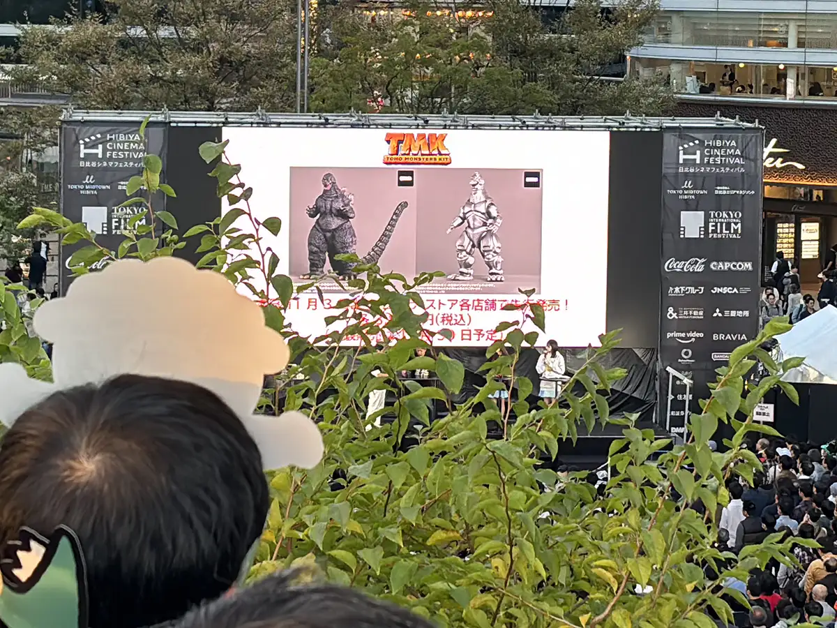
An amazing thing happened in Japan during my latest trip. Godzilla Fes 2024, Godzilla Day and Godzilla’s 70th Anniversary Celebration was nothing short of great. But what happened surpassed my imagination and expectations. Announcements of new merch have filled our social media feeds for the last several months. Our expectations have been at an all time high. But little did I know that the project I had completed for Toho just weeks before my trip would be up front and center at the Godzilla Stores from Tokyo to Osaka.

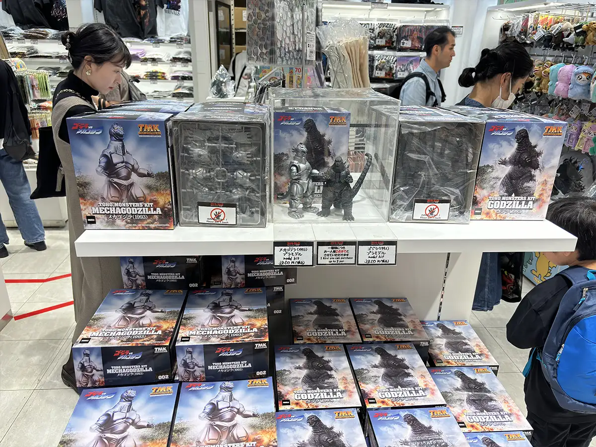
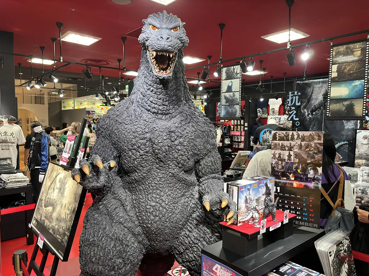
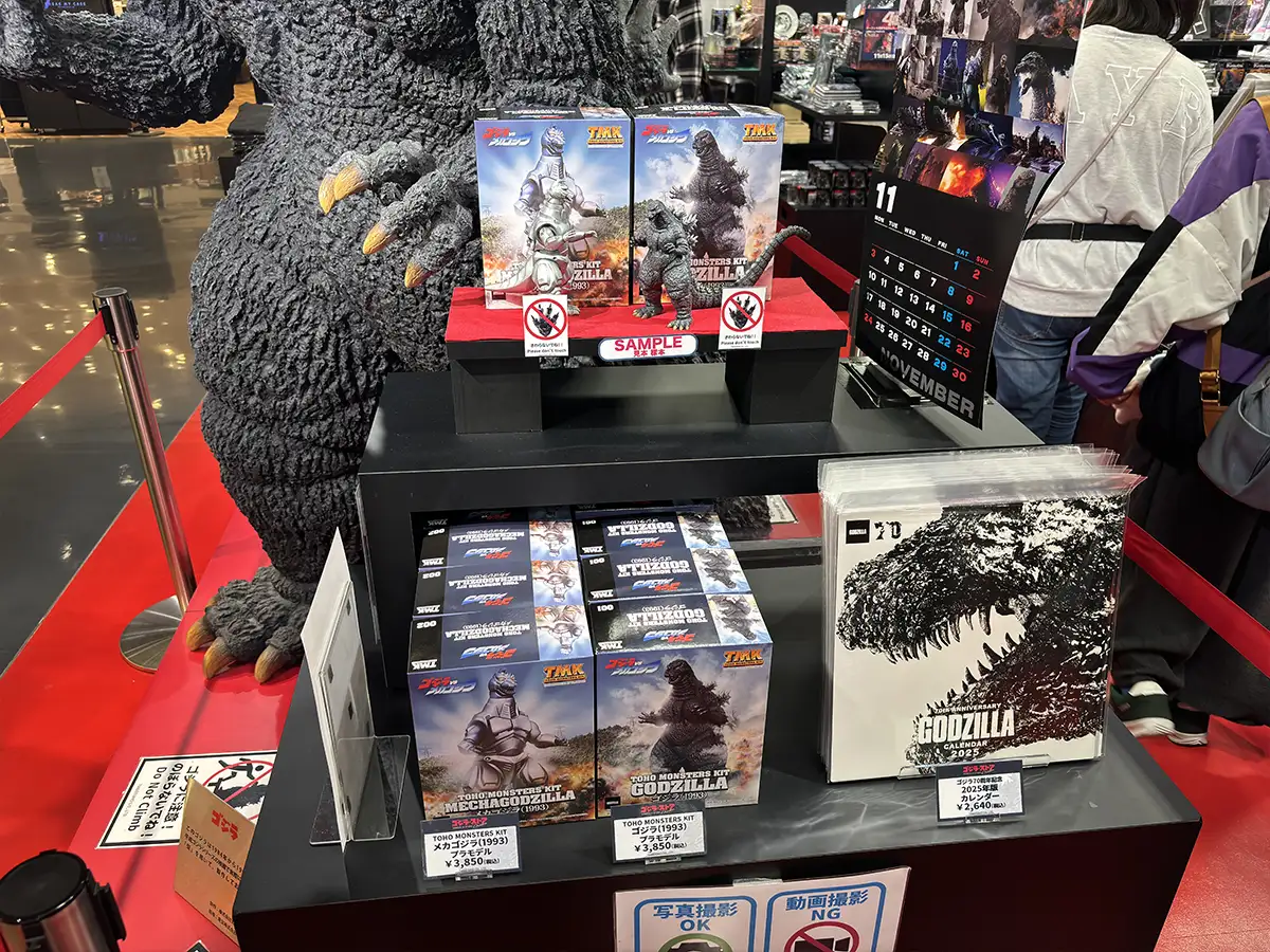
Toho Monsters Kit Godzilla 1993 and MechaGodzilla 1993 Plastic Model Kits on display at Chanter Godzilla Store on Godzilla Day (11/3/2024)

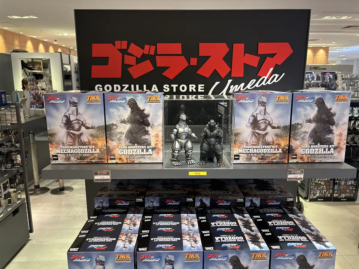
Early Sunday morning on Godzilla Day Alex and I jumped in the long line in Godzilla Square for time-stamped tickets to the Godzilla Store. After the opening stage event we hurried off to the 3rd floor of the Chanter department store adjacent to the stage. While once again waiting in a long line to enter the pop-up shop, out of the corner of my eye I spotted the Toho Monsters Kits. I couldn’t believe my eyes. I wanted to explode inside. I had no idea that Toho would market their new and latest model kits so prominently on Godzilla Day. There was my work on display across Japan to see. Every Godzilla Store from Chanter in Hibiya to the Tokyo store in Shinjuku to the Osaka stores in Daimaru Ueda and PARCO department stores, the Toho Monsters Kit Godzilla 1993 and MechaGodzilla 1993 (TOHO MONSTERS KIT ゴジラ (1993) プラモデル and TOHO MONSTERS KIT メカゴジラ (1993) プラモデル) was on display.

  • gallery-item
  • gallery-item
  • gallery-item
  • gallery-item
  • gallery-item
  • gallery-item
  • gallery-item
  • gallery-item

Toho Monsters Kit plastic model kits on display at Godzilla Stores across Japan

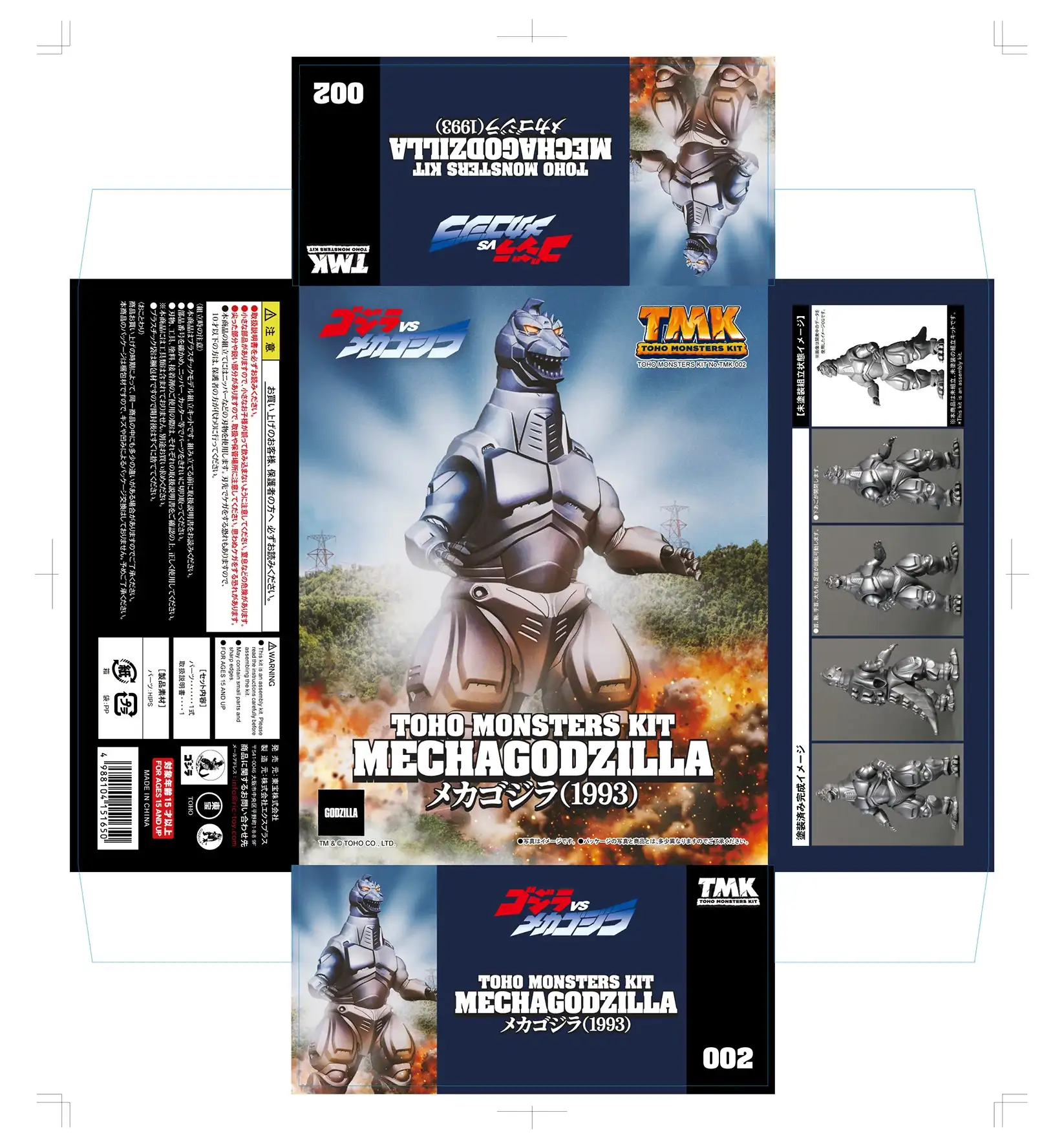
The creation of the box art had unique challenges. There was no toy photography to take or to work from but rather 3D images were provided. Working with those graphics required many hours in Photoshop manipulating filters, layers and image properties with varying degrees of trail and error. Toho requested that the backgrounds appear seamless creating a complete scene when the boxes were placed beside each other. Many layers were required to create the background sky and hills with electric lines. Explosions, light and smoke effects in the foreground to create visual interests and focus. I added the glowing light effect behind MechaGodzilla similar to his appearance in the Suzuka Mountains. Similarly I added smoke behind Godzilla playing on his powerful nuclear pulse emitted during their final battle at the Chiba Marine Stadium.

Toho Monsters Kit box art for Godzilla (full box) and MechaGodzilla (full box) created by MyKaiju

I love the challenge of toy photography and packaging design. But the creative liberty of the former must give way to the restraints of the latter. Art for packaging must support marketing strategies, put forward the best possible presentation of the product, and excite the consumer to make the purchase. On the package the product must have visual priority reflected in its sharpness, scale, size and prominence in relation to all other graphic elements on the box. Other than illustration, the product must be faithfully represented. The limitations of the figure and articulation restrain the design for dynamic poses and shot angles. In the final design, I sought to get the show the best of the 3D rendering in an appropriate environment.

I was also responsible for the typesetting, typography and the creation of the Toho Monsters Kit logo. Choosing the best typeface is challenging. The font face, width, weight, contrast, serifs and geometry  must support and reflect the product and its name. I have a large font library from which to choose. But the choice is more difficult for multilingual packaging (eg, Japanese and English). I wanted a strong face and Aachen Bold was the best. The Japanese kaiju names were set in Shippori Antique B1 Regular with the year in DFP極太楷書体. I carefully tightened the tracking and kerning to add to the strength of the font face. A three-dimensional drop shadow was added to create depth and separation and sense of movement from the background. A Mincho (serif) Japanese typeface was selected over a Gothic (sans-serif) face to create more contrasts.

The creation of the TMK logo needed to be strong, powerful, appropriate, memorable and reusable. The logo must be scalable without loss of resolution. Therefore it must be created vector-based art in Adobe Illustrator while using gradients and highlights effects that would be most easily created as resolution-dependent art in Adobe Photoshop. Finding the balance between designing a long without creative restraint and the practical need for a logo that is usable in every size and format is key. Logos must work in black-and-white as well as in color. The variants of the logo must be created for dark and light backgrounds. Logos must be scalable and readable at small sizes.

The goal of the overall design was to create a clean creative presentation of the product that satisfies my personal professional criteria, meets the client expectations and generates consumer interest and desire. I hope that I have. I thought seeing the TMK model kits revealed on the Godzilla Channel on YouTube was amazing. But their debut on Godzilla Day across Japan was an incredible surprise and honor. I bought the two kits and hope you do too. Thank you Toho, Matsubara-san, Jeremy and X-Plus!