1.30.15
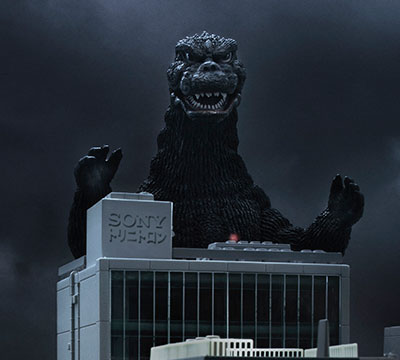
Today, I took another break from work and embarked on day-long project. I decided to recreate the theatrical poster for the 1954 Godzilla. Yuji Sakai’s Bandai Complete Works Final Godzilla 1954 was perfect for shooting. The background and foreground would be Japan’s Diet Building and the stand from another of Sakai’s dioramas, respectively. Below is the finished product and the explanation of the steps involved in recreating Godzilla posters.

My Godzilla 1954 Theatrical Poster
Here is the original poster for comparison. There are notable differences. The layout, title, credits, and typography give it more likeness. Sometimes supporting imagery cannot be recreated nor found. Substitutions must be made. Choices, compromise, and limitations are par for the course. In the end, it doesn’t have to be perfect. My hope is to make something eye catching, pleasing, and memorable.

The Original Godzilla 1954 Theatrical Poster (© Toho Co. Ltd.)
I’ve found that the keys to the best shot are lighting, positioning, camera settings, good post-production, and above all patience. The process I use in recreating a Godzilla poster can be broadly outlined as follows: 1) Setting up the shot, 2) Taking the shot, and 3) Cleaning up the shot. There are multiple steps in each.
1) Setting up the shot. This step is crucial because the success of everything that follows depends upon it. This step involves staging, lighting, and positioning the subject, foreground, and background. Before staging anything, it is important to deconstruct and reconstruct the scene of the poster analyzing the perspective, scale, and composition. Study, analyze, and know the original poster. There will always be limitations and restrictions, but identify the design elements that define the poster. The strength and secret of my shots lie in the use of a computer monitor for the background. The monitor offers control over brightness and scaling that paper backgrounds cannot. However, the pixels and screen refresh rate must be kept in mind. Using the computer as the background allows for seamless integration and greater authenticity and believability. The size, scale, and color are crucial. Selecting the background can take time. I typically search Google /images for background that come close to that of the poster or movie scene. Sometimes I’ll use a screen capture of the movie scene. It is important to be able to scale the image up or down without losing resolution.

Diagram of my typical set up
Next, I determine the spacing, positioning, and elevation between the subject matter and background. I try to use the Japanese tokusatsu technique of forced perspective. This technique involves selecting objects that have varying scales to create the desired perspective in limited space. This is the trick for creating great shots. Also consider depth of field, that is, the amount of or lack of focus between the foreground and background. Once everything is set up, the lighting is arranged for maximum effect while trying to keep post-production work to a minimum. Making adjustments to the spacing is a given at this point. After I position the subject matter, I situation any props in front or behind to create a sense of depth. The scale of each object is important and may require unusual scales and forced perspective. Lighting follows. The color and position of light is crucial. Miniature lights from IKEA are handy. Rigging is tricky and you never know what you might need to use to hold up the lights. Having tape, boxes, books, cups, boards, and tables are helpful.
2) Taking the shot. This step is more than simply pressing the button. Taking the shot requires being aware of all the metrics such as aperture, shutter speed, and ISO. Getting the desired depth of field is a science requiring the right relationship between the aperture and shutter speed. Bracketing every shot is helpful. Changing the angles and focus are also important. It’s better to have more shots that you don’t need than not have enough. I take as many shots as needed, but only one will be selected. I always miss some detail from the shot. Shadows will fall in the wrong places. There won’t be enough light on the subject matter. There may not be enough background image showing. A lot can and does go wrong. But mistakes sometimes are a blessing in disguise. Deciding which image to use can sometimes be easy but other times disappointing when a great shot has to be set aside because it doesn’t fit the design.

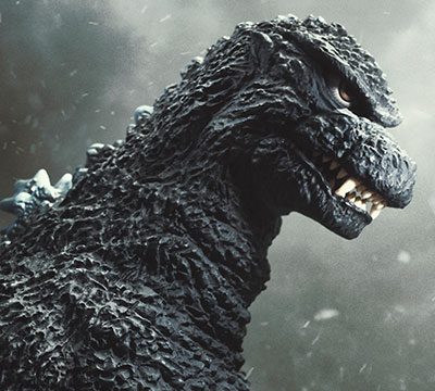
Photo from my Godzilla 1954 photo shot
3) Cleaning up the shot. This is when the fun begins and the final product comes together. However, this is where most of the time will be spent. Expect spending hours in Adobe Photoshop, an essential design application for photo editing and manipulation. Its tools are second to none. This is where desire, drive, and determination make the difference between a winner or loser. You may not know every Photoshop technique but experimenting is the mother of invention. Transforming a seemingly below average shot into worthy poster is both an art and science. Begin by setting the format of the poster (e.g., print/screen size and resolution). Rotating, scaling, and cropping are first. Correcting color, exposure, saturation, levels, curves, contrast, and brightness are second. Making clipping paths, masking, apply filters, and making gradients are the detailing that makes the difference. It’s important to move back and forth between the subject matter and the background, between the details and the big picture. Adjusting the background color, texture, and details. The subject matter must stand out from the background but not look like a cutout. Add and embellish lighting that was lacking in the photo shot. Clipping paths around the subject matter may be required. Patience is required but the effort to make clean edges around objects is worth it. Add shadows, textures, and additional elements as needed. For example, in the 1954 poster, the planes are modified /images of real and model Japanese aircraft.

Screen capture of my Photoshop digital file
Last, the graphical and typographical elements of the foreground are created. These include the title, teaser texts, credits, and logos. Sometimes the success of a project involves the details that go unnoticed and are assumed. But if anything is missing from them or out of place they become very noticeable. These elements make or break a theatrical poster. Finding the right fonts or substituting fonts with the best choice is crucial to believability. Sometimes recreating fonts, logos, logotype, and geometric is a normal part of the course. There’s no software better than Adobe Illustrator for recreating type and line art. Illustrator includes a trace tool that creates vector-based line art from photographic /images. This is priceless for unique poster type and graphics. Most often, the Japanese text from the original posters requires manual input. For years the Mac OS has made Japanese input easy providing easy toggling between languages and keyboards. Google translate, Wikipedia Japan, and online Japanese-English dictionary are great resources. Showa Godzilla movie posters typically incorporate the pictures of cast members. Finding and formatting obscure photos is a challenge requiring long Google searches and/or scanning. The time and effort you put into these steps make the finish poster rewarding and something others will be enjoy with you.
The 1954 poster is not as complex as the others. However, recreating this poster posed its own challenges. Typically, mistakes aren’t found until the project is thought to be finished. But mistakes sometimes turn out to be a good thing. For example, the background shows between Godzilla’s legs. This is not the case in the original. However, the contrast in the bright blue sky and the smoke-filled fiery dark sky above Japan’s Diet Building creates good contrast like that of the ominous dark storm clouds of an approaching tornado pushing away the resending bright blue sky of a warm afternoon. In addition, I moved a portion of the credits down so the guns in the foreground would be seen. I added gun fire to echo the original poster. It works but changes the design. The coloration, contrast, and highlights were difficult to change and control. But I reached an artist compromise that is pleasing. The movie’s cast from Emiko to Dr. Serizawa were recreated and colorized from original black-and-white photographs found through a Google search. I had to use another photo of Dr. Serizawa because I could not find a match. Overall, I feel like mission accomplished! The reward is the journey as much as the product.
Since last year, I’ve been developing my amateur photography skills. I learn and acquire new Photoshop techniques as I try to recreate these poster. Each new poster allows me greater creative expression, deepens my appreciation for the movie art of Godzilla, and improves my knowledge of photography. I don’t have a full frame DSLR but I’m learning to get the most out of my 18-megapixel Canon EOS M and its 15mm macro lens. With that said, I find that I like to photograph miniatures because of the macro detail and smaller scale lighting needed. I’m honing my style and learning how to capture tokusatsu effects. My goal is to recreate each of the thirty Godzilla movie posters from 1954 to 2014. I hope you enjoy the product as much as I do in creating it.
Updated 1.30.15